Branding - BSKD
Industry
/
Client
BSKD
Service
Branding
Date
2021
BSKD is a collective of four Twitch streamers seeking a bold, dynamic, and modern brand identity with strong Japanese inspirations. The goal was to create a cohesive visual system, including a logo that reflects their shared identity, while allowing personalized variations for each member.

📌 Project Overview
The challenge was to design an identity that balances brutality and energy, while integrating Japanese symbolism and a modern esports aesthetic. The branding had to be instantly recognizable, scalable across digital platforms, and adaptable for Twitch stream assets.
🎯 Objectives
Create a strong, unified brand identity reflecting the group’s energy.
Incorporate Japanese design principles, focusing on historical emblems.
Develop a flexible visual system with personal color variations.
👤 Role
Brand Designer: Led the creative direction, from logo development to stream overlays.
🛠 Process & Methodology
1️⃣ Research & Concept Development

Japanese Symbolism Exploration: Studied historical samurai crests (家紋, Kamon), focusing on circular compositions, repetitive symbols, and the power of odd numbers—especially the number 3.
Balancing Brutality & Modernism: Combined sharp, angular shapes with organic circular elements for a structured yet energetic feel.
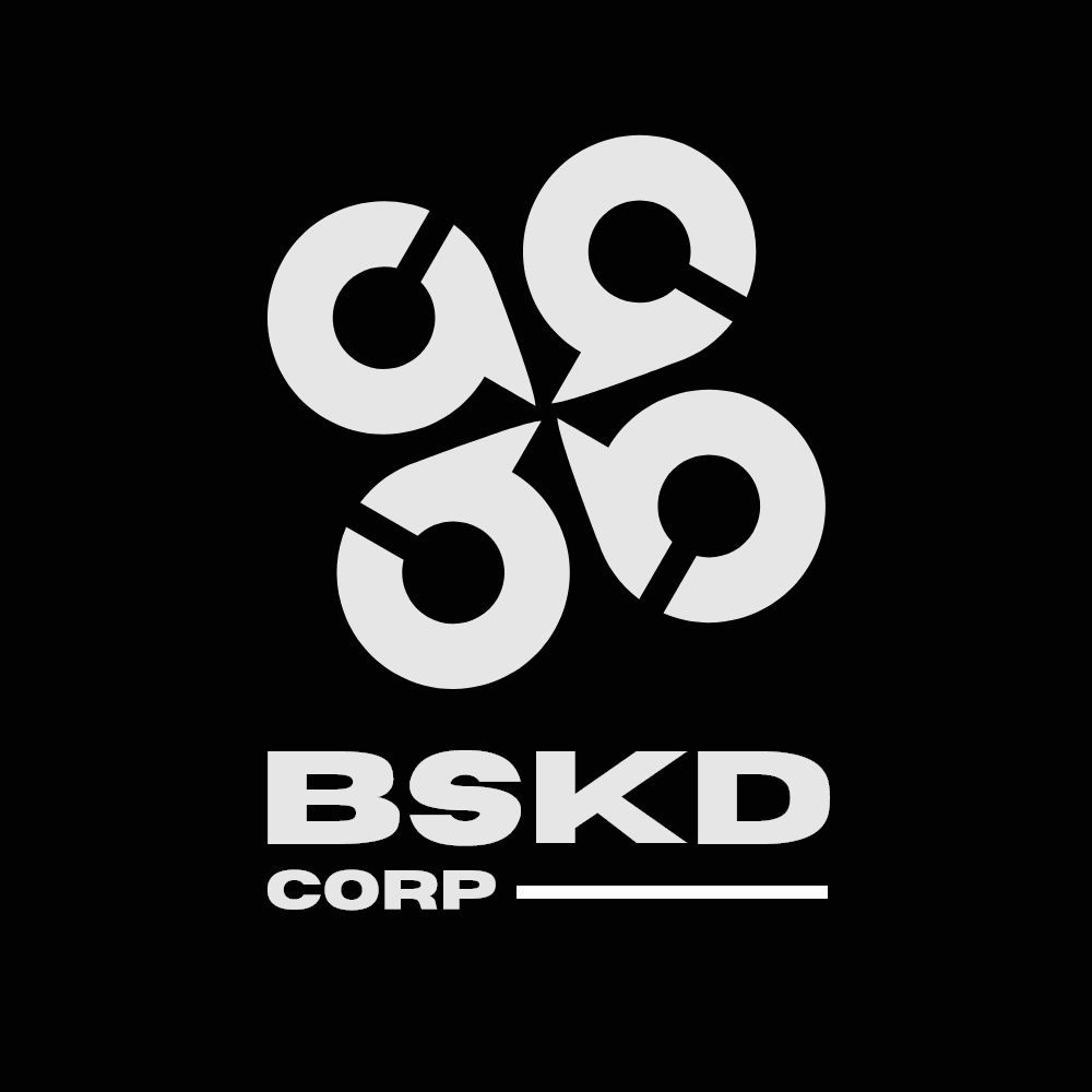
2️⃣ Logo Development
Rounded Structure: Ensures a smooth, unified look, referencing traditional family crests.
Sharp Points for Energy: Adds dynamism and a sense of action.
Symbolic Repetition: Four mirrored elements, representing the four members of the collective.
Letterform Inspiration: The structure subtly echoes the letter “B”, reinforcing brand recognition.

3️⃣ Color System & Typography
Vibrant Backgrounds + Brutal Black Logo: The contrast creates a modern, high-impact look.
Personalized Color Variations: Each streamer gets a distinct color while maintaining brand unity.

Typography – Horizon Font: A bold, wide, brutalist typeface to counterbalance the subtlety of Japanese influences.

🚀 Outcome
Fully developed branding system that blends traditional Japanese aesthetics with modern esports energy.
Strong logo design that is both symbolic and scalable for digital and streaming use.
Cohesive visual assets, ensuring a recognizable brand presence across multiple platforms.
💡 Key Learnings & Challenges
✔ Balancing historical Japanese influences with a brutalist modern approach.
✔ Creating a group identity while allowing for individual customization.
✔ Ensuring stream visuals complement content, rather than distracting from it.